New Circlepix users were supposed to get onboarded through a setup wizard. Instead, many were calling the support team. User research revealed the same problem across customers: information overload in an interface that had never been designed for clarity. This was the redesign that changed that.
Project Details
- Client: Circlepix
- Role: Lead Designer
- Scope: User research, UX redesign, prototype testing
- Prototype: New Setup
The Challenge
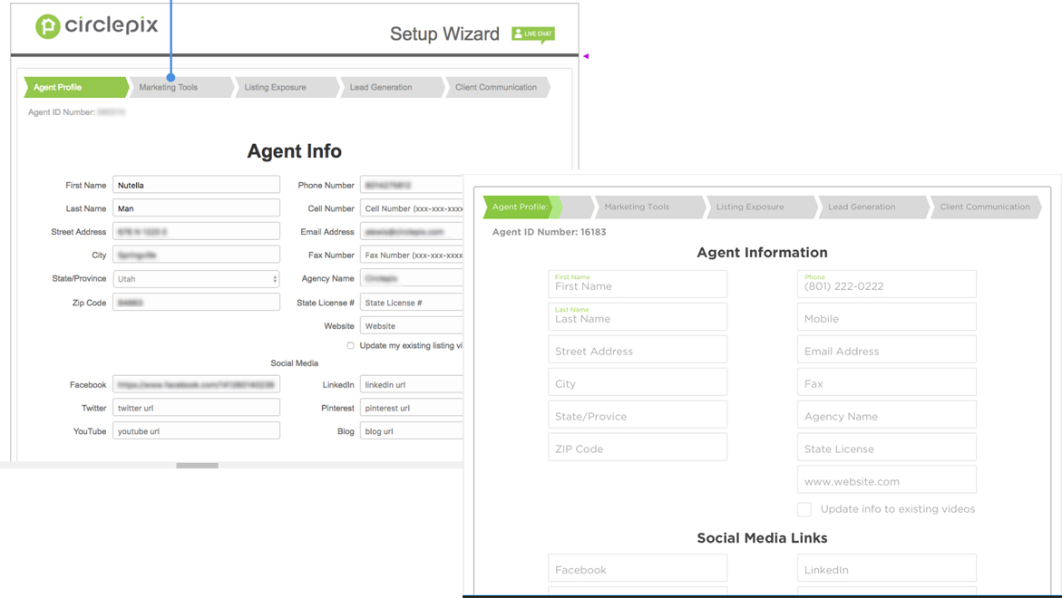
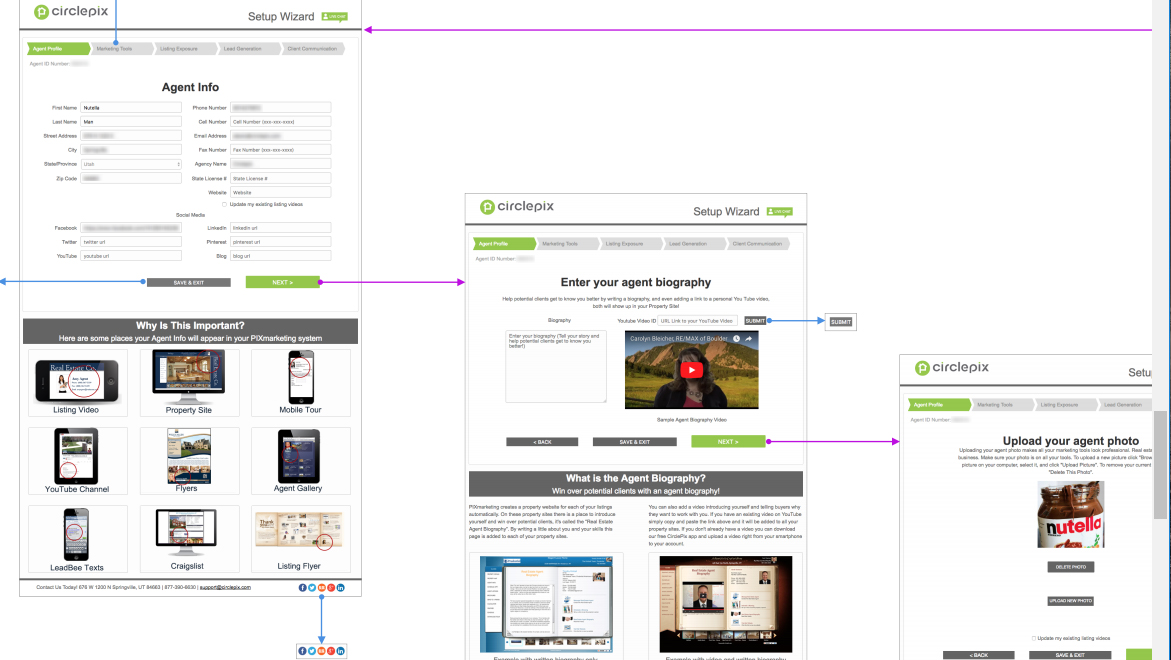
Circlepix's setup wizard was the first experience a new user had with the platform. It was also where many of them got lost. Real estate agents and photographers signing up for the platform encountered an interface that front-loaded too much information, offered no clear sense of progress, and looked like it had not been updated in years. The result was predictable: confused new users calling the support team before they had even finished setting up their account.
The Strategy
User research calls with existing customers identified the specific points of confusion -- not a general sense that the wizard was difficult, but the exact moments where users stalled or gave up. The two consistent findings were information overload at the start of the process and no visual indication of where they were or how much remained. Both problems had a clear design solution.
The Execution
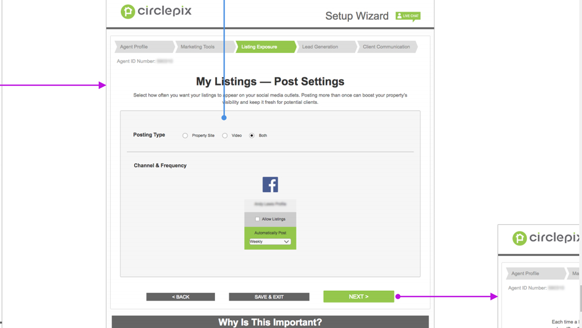
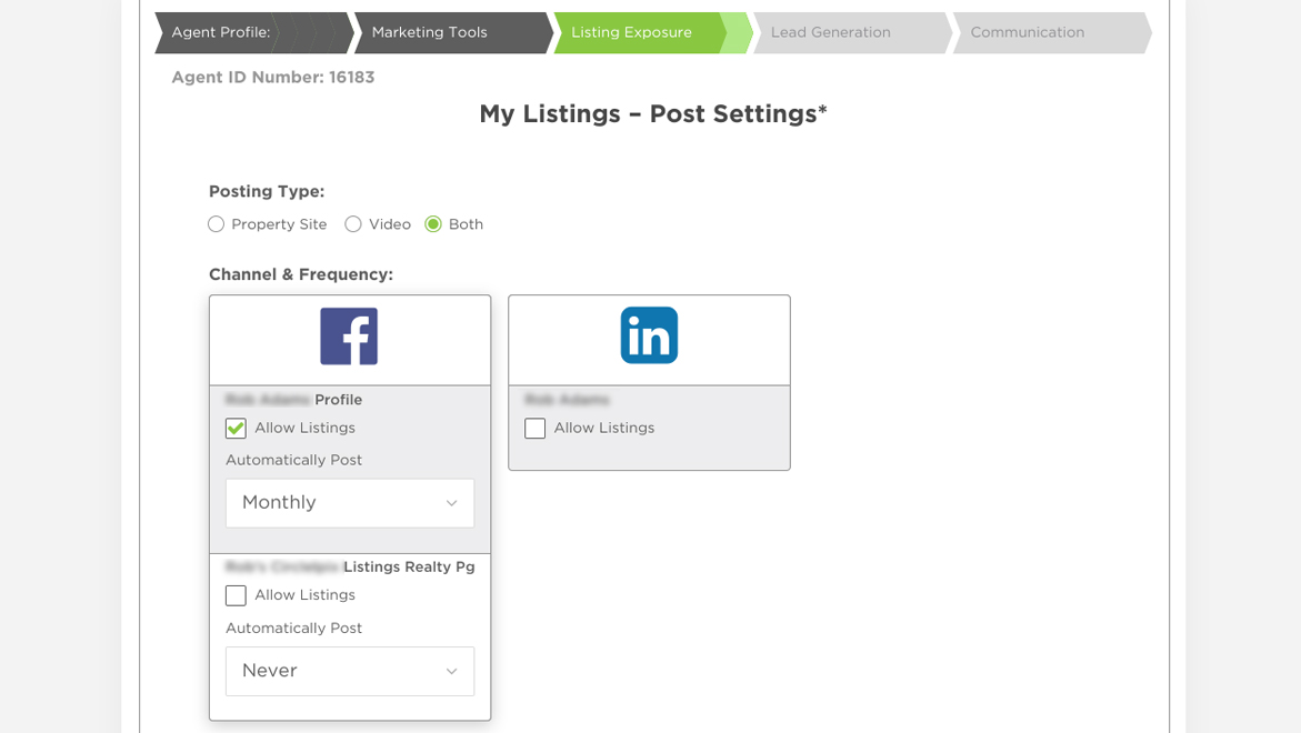
Working closely with a front-end developer, the interface was cleaned up screen by screen: reducing the information density at each step, establishing a visual language that matched the platform's updated direction, and adding progress indicators that kept users oriented throughout the setup flow. The goal at each stage was to give users exactly what they needed to complete that step and nothing more.
A prototype was built and sent directly to customers for feedback before development was finalized -- a step that confirmed the direction was right and surfaced a small number of edge cases before they became built-in problems.
The Results
Customer feedback on the redesigned wizard was positive. The clarity improvements -- reduced information load and visible progress tracking -- addressed the core reasons users had been calling in for help during setup. The same support team that fielded those calls had one fewer source of incoming tickets.