74% of 200+ students surveyed admitted to using their phone while driving. Not occasionally. Regularly. The existing apps designed to fix this were built on guilt and restriction -- and they were not working. Sevare was designed on a different premise entirely: make locking your phone feel like a win.
Project Details
- Client: Sevare
- Role: Senior UX Designer
- Team: UX Strategist + 2 Senior UX Designers
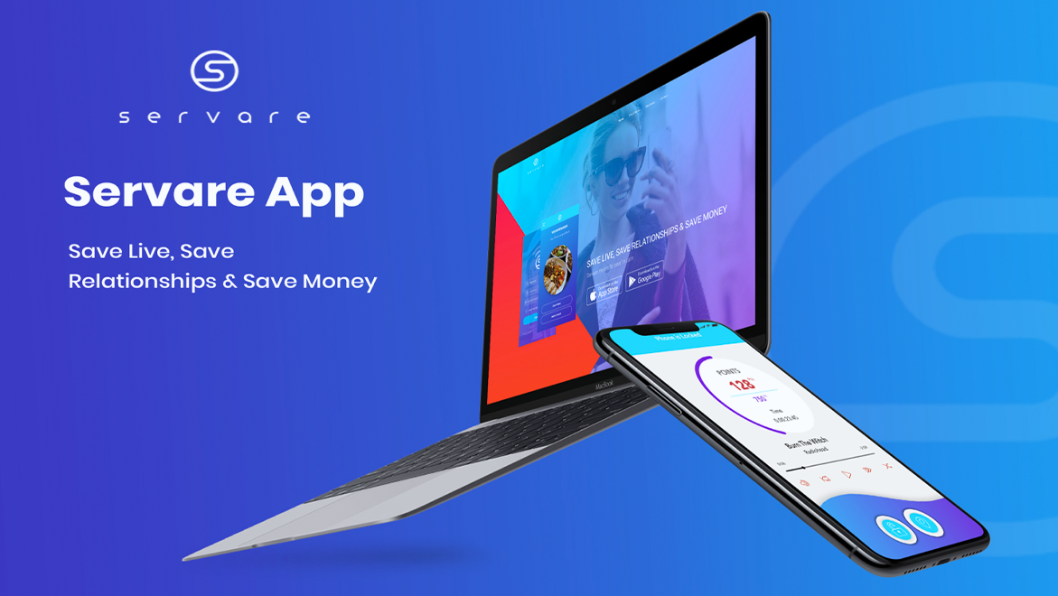
- App: servare.app
The Challenge
Distracted driving is a well-documented problem with poorly designed solutions. Survey research with more than 200 students found that 74% admitted to using their phone while driving. The more revealing finding was not the number -- it was the reason restriction-based apps were failing to change it. Apps that blocked access and issued warnings produced resentment rather than behavior change. People felt punished for a habit they already knew was dangerous. Guilt without an alternative is not a strategy.
The Strategy
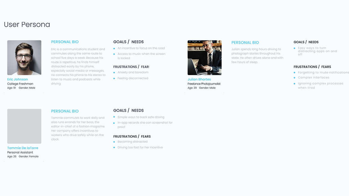
The team centered the design on one behavioral economics principle: make the desired action feel like a reward, not a sacrifice. The college student checking social media at a red light, the freelance photographer pulled by notifications, the professional whose employer monitors safe driving for insurance -- all three personas shared the same underlying truth. They did not need to be told the phone was a problem. They needed a reason to put it down that felt better than picking it up.
Sevare's answer was to turn each drive into a points-earning session. Lock your phone, accrue points, redeem at participating restaurants. Competitor analysis confirmed what the research suggested: complex, lecture-based apps rarely inspired lasting change. Simplicity and an immediate, tangible reward were the design mandates.
The Execution
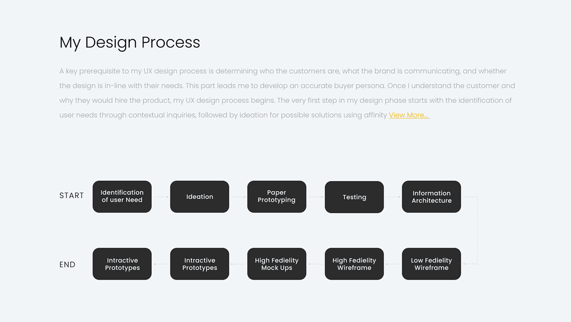
The process ran the full research-to-prototype arc: user need identification, ideation, paper prototyping, usability testing, information architecture, wireframes, and high-fidelity mockups. The three personas kept the design grounded in real behavior patterns rather than idealized ones, covering different driver profiles, different motivations for phone use, and different relationships to the risk.
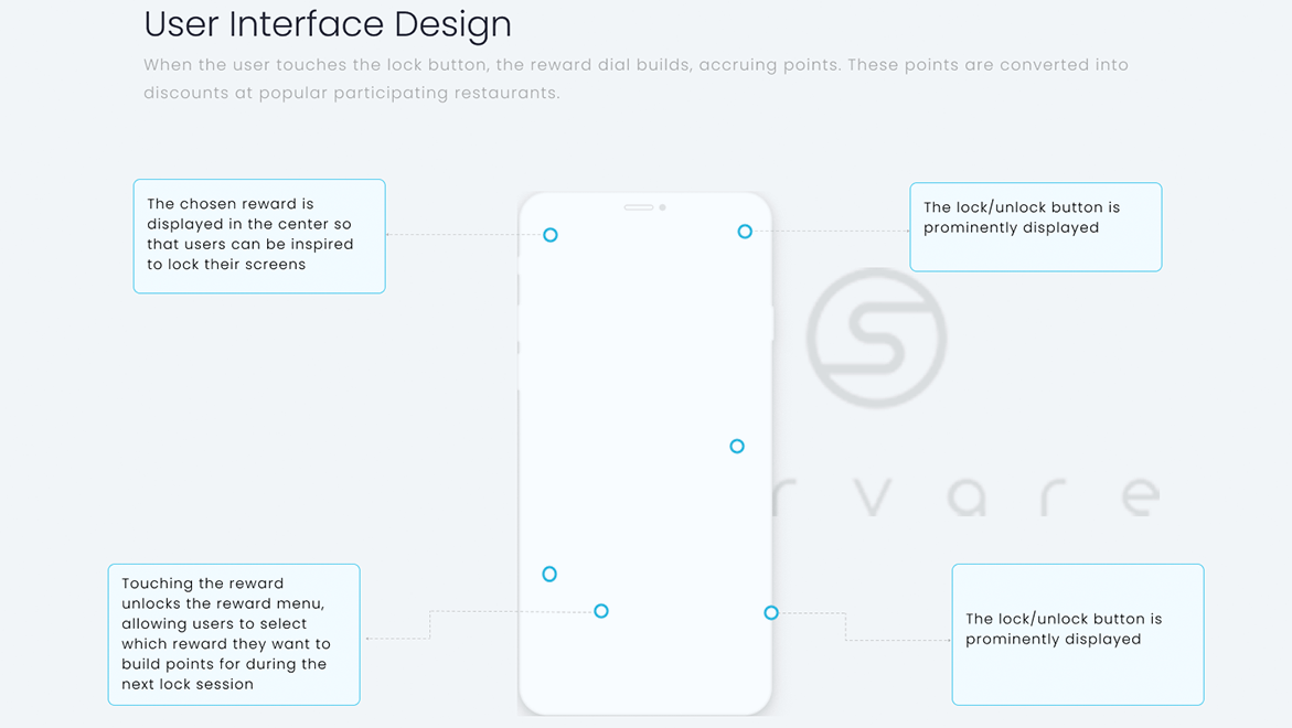
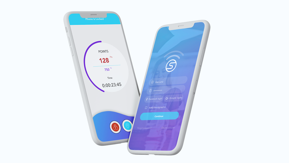
The core UI decision was the reward dial: a single lock button that begins accruing points when pressed, displayed as a building dial with the chosen reward visible at its center throughout the drive. The goal is always in view. Calls and texts are blocked during the session while music stays accessible, reducing cognitive load without eliminating functionality people genuinely need behind the wheel.
The Results
The project reached high-fidelity prototype stage with a complete UX foundation: survey research, personas, tested user flows, and polished UI. The behavioral model at the center of the design -- incentive over restriction, reward over guilt -- is the argument the work makes. Whether it shipped or not, that argument is made clearly in the prototype.