The new scholarship system is for internal use but there is a section that the students would be able to interface with.
Project Details
- Client: BYU
- Role: Lead UX/UI Designer
- Scope: Student-facing interface, responsive design, UXPin prototype testing
- Related: Scholarship System
- Prototype: UXPin Demo
The Challenge
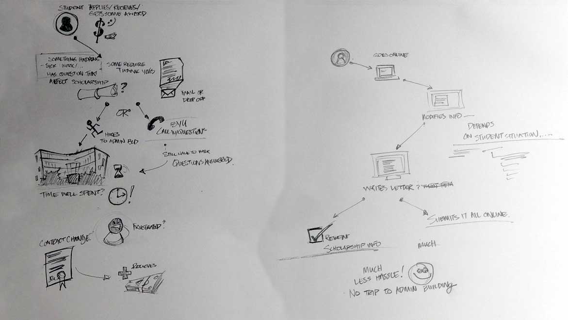
Most of the BYU scholarship system was built for the people running it: Financial Aid staff managing awards, processing contracts, and tracking renewals. But students were part of the system too, and their experience had been almost entirely invisible to it. A student who wanted to see their scholarship history had no self-service path. A student who needed to submit a required thank you letter to a donor had two options: walk to the admin building, or mail it. There was no digital option. No visibility. No confirmation that anything had been received.
The challenge was designing a student-facing interface that felt like it belonged to the students rather than to the institution -- responsive, clear, and genuinely useful on whatever device a student happened to be using.
The Strategy
The student interface was designed from a different set of constraints than the rest of the system. Internal staff used the scholarship system on desktop, in an office, during working hours. Students used it everywhere else. That meant responsive design was non-negotiable for this portion of the project, even though the rest of the system did not require it.
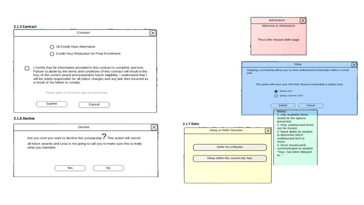
A UXPin prototype was built before any development began, and students were brought in to test realistic scenarios: checking scholarship status, reviewing history, and completing the thank you letter flow. The testing sessions surfaced how students actually navigated the interface under real conditions, and the feedback shaped the final interaction model before a single line of production code was written.
The Execution
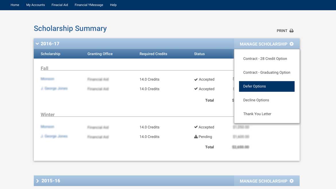
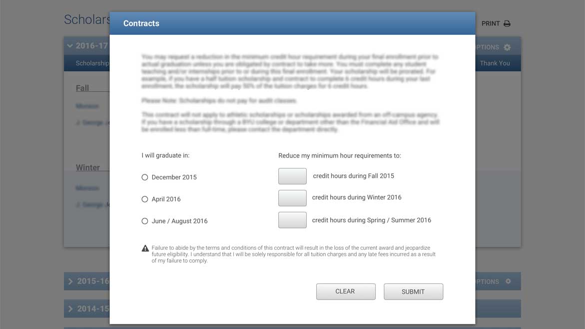
The interface gave students access to their current scholarships and a full history of awards since they enrolled. Scholarship contract modifications, which had previously required in-person visits or back-and-forth with the Financial Aid Office, were handled directly in the interface.
The thank you letter feature was the most human detail in the project. Donors fund scholarships with the expectation that recipients will acknowledge them. The requirement had always existed, but the process for fulfilling it was entirely manual: write a letter, address an envelope, mail it, hope it arrived. The redesigned flow let students write and submit thank you letters digitally, routed to the correct donor without the student needing to know a mailing address or make a trip. The post office errand became a form submission.
Responsive table handling was a specific design problem worth its own solution. Scholarship history involves structured data that breaks badly on small screens. A custom responsive table pattern was developed and documented for the development team, giving them a clear approach for handling dense tabular information across screen sizes.
The Results
Students gained visibility into a process that had previously been opaque to them, and the thank you letter workflow eliminated a friction point that had existed as long as the scholarship program itself. The UXPin prototype testing confirmed the interaction model before development investment was made, and the responsive design gave the student interface a different quality from the rest of the system -- one built around where students actually are, not just where the institution expected them to be.